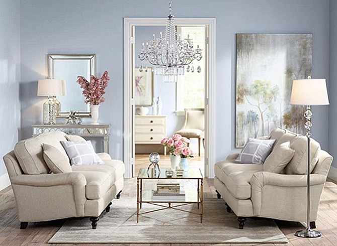
Serenity, a shade of blue that was named a Pantone Color of the Year selection for 2016, can work as an alternative to the popular neutral palette, says Amanda Mertins of Patina Polished Living. Photo courtesy of Patina Polished Living
“Colors create moods by their relationships to each other. Different color combinations evoke a different sense of energy in a composition.”
— Kathryn Horn Coneway, Art at the Center in Alexandria
Two colors, Serenity (light blue) and Rose Quartz (pale pink), were recently named the Pantone Color of the Year selection for 2016. Pantone provides professional color standards for the design industries, and each year, the hues are credited with influencing fashion and interior design.
This is the first time in the 16-year history of Pantone’s annual color crowing that the honor has been bestowed on two hues.
From upholstery and paint to decorative accents and works of art, local designers offer thoughts on how the demure shades can be incorporated into interior décor.
“Light blue shows warmth and is welcoming,” said James Nicolson, vice president of Sales and Operations at Tech Painting Co. in Alexandria. “Periwinkle is a common color for powder rooms and eat-in kitchen areas. But pink is kind of a strange color because if men are involved, they are often put off by it."
Gretchen Fuss, an Alexandria-based artist and interior designer, incorporates the shades into her own works of art. “There are realistic ways to use these colors,” she said. “Serenity is by far one of my favorite shades of blue and I will revisit it in my artwork. Rose Quartz and Serenity remind me of the sun setting on the water. I see both as soft accents that can easily marry into the styling of the gray regime.”

Designer Courtney Cox of Ivy Lane Living in Alexandria says she and her partner Alex Deringer used the pink hue in a bedroom of the D.C. Design House last year. “While we didn’t expect that Pantone would select two shades for its color of the year, we were charmed but not completely surprised to see Rose Quartz in the mix,” she said. “We have been loving the warm, inviting hue for a while now.”
Fresh alternatives to the traditional neutral palette is how Amanda Mertins of Patina Polished Living in Alexandria describes the Pantone picks. “Think pale soft pink walls with a muted blue sofa,” she said. “These colors work best together if you keep your furniture and accessories sleek not fussy. Individually they lend themselves to linens, accent chairs and throw pillows.”
Pantone’s Color of the Year selection began in 1999 and serve as a barometer of the current mood of society. The 2016 picks offer tranquility, evoke inner peace and provide a respite from the stress of daily life.
“Serenity and Rose Quartz demonstrate an inherent balance between a warmer embracing rose tone and the cooler tranquil blue, reflecting connection and wellness as well as a soothing sense of order and peace,” said Leatrice Eiseman, executive director of the Pantone Color Institute in announcing this year’s selection.
Local artist and author Kathryn Horn Coneway of Art at the Center in Alexandria appreciates the decision to choose two colors and believes that color has the power to affect emotions. “Colors create moods by their relationships to each other,” she said. “Different color combinations evoke a different sense of energy in a composition.”