Should the City of Fairfax change its name to Fairfax City? What should its new logo look like? What shape should it be, and what colors? These and other questions have been under consideration by the City Council as it determines the City’s brand and identity.
A year ago, Council gave the City’s Economic Development Authority $300,000 for this project. And this spring, marketing firm Gensler was selected to review Fairfax’s current brand use and strategy.
Meanwhile, a branding committee of residents and City staff met over a six-month period and collected information from residents, business owners and City departments. They were asked to list Fairfax’s strengths and weaknesses, and this information was presented to Gensler. Then during May and July work sessions, the Council received a progress report.
Kate Kirkpatrick, communications strategist with Gensler, said the City needs to determine what it wants to be and what it wants to be known for, and then Gensler can help tell its story “in the most compelling and consistent way.” It’ll also develop a brand marketing plan and help launch it.
DESCRIBING THE CITY’S STRENGTHS, people called it historic, stable, affordable, diverse, business-friendly, responsive, compact and well-located, with highly engaged citizens. They also liked its Old Town Square, CUE bus system and proximity to Metro and George Mason University. Negatives were that it’s “car-centric and not pedestrian-friendly, and has no clear identity or stated long-term vision.”
So to better promote what the City has to offer, Gensler will aid it in defining and then expressing its essence, promise and personality. “This is to help the City expand and grow to keep it the place that people love,” said Kirkpatrick. “The brand is the promise and expectation of what people will get from living and visiting here.”
Stressing a centered theme, she said Fairfax is accessible and centrally located for people and businesses. It’s also established, while still evolving and embracing change, and its residents have a positive outlook with a “real sense of connectedness to the community and its leaders.”
Kirkpatrick also touted the City as being friendly, welcoming and inclusive, filled with “active, capable and forward-leaning” people. However, she said, if it changed its name from the City of Fairfax to Fairfax City, it would be a “refreshing, streamlined” way for people to view it.
Councilman David Meyer said it was originally the Town of Fairfax before becoming a city, and Councilwoman Janice Miller said Fairfax City is “easier to say.” Councilwoman Ellie Schmidt said the change was fine with her.
“We are the Fairfax City Council and we’re in Fairfax City Hall,” added Mayor Scott Silverthorne. “I think we can be both the City of Fairfax and Fairfax City.”
The broader question, said Meyer, is “How is the City perceived? It’s much more than simply a name.” Councilman Michael DeMarco said it’ll take a cultural change and some advocacy, and Kirkpatrick said Gensler will give the City all the tools it needs to carry it out.
Currently, said Silverthorne, “There’s inconsistency around the City when it comes to marketing ourselves. We’ve got different logos and signage even within departments, such as Parks and Rec. There has to be some theme.” Parks and Recreation Director Cathy Salgado then said the City will receive a style guide telling it when and how to use the new logo.
“Part of it is a pride thing,” said Silverthorne. “I want the residents to want to live here.”
“The devil will be in the details and it’ll be extremely important,” added Councilman Jeff Greenfield. “Are we changing the City signs? Are we completely changing from the City of Fairfax to Fairfax City? And what are the costs associated with it? What about the City schools? And when will the new name apply – and to which events?”
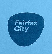
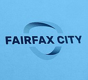
Kirkpatrick and her team returned again to the Council on July 5 to present the branding committee’s two, final recommendations regarding brand strategies and logos. She suggested the slogan, “Live Life Centered,” and showed one logo shaped like a guitar pick with the words, “Fairfax City,” in a small typeface inside it, and another logo of an open ring with a larger-sized “Fairfax City” written boldly across it.
She also presented artist’s renditions illustrating what each logo might look like on various City signs and business cards. And based on the colors in the City’s seal, she suggested a possible color palette that could be used for the changes.
“Fairfax is a special place with a good story to tell, and we want to help you do it,” said Kirkpatrick. “This is the end of our expression phase and the start of our launch phase.
Gensler graphic designer Pierce Fisher then explained how the logo could be applied. He said the guitar-shaped one is actually the shape of the existing City seal. “It could be put on buses, business cards, apps, social media and streetlight banners,” said Fisher. “And it could be looked at as a window – something you can look through to see what’s behind it. However, the other logo is more energetic, has more movement and is more colorful and inclusive.”
Kirkpatrick said the committee preferred the second one, as did Chris Bruno, the City’s new economic development director. But she stressed that the City seal would still be used for the City flag and official documents. “You could start using it now and go public with it at the Fall Festival,” said Kirkpatrick.
Schmidt said a logo would give Fairfax consistency, and Councilman Jon Stehle said it would unify “all the City departments, instead of each having its own logo. And the second logo provides that energy look and fluidity.”
Agreeing, DeMarco said that one is “more modern and fresher. But I don’t like the word, “centered.” I’d prefer “connected” – to the City, within it and on social media.”
SILVERTHORNE said he and Bruno also prefer “connected,” as does the City’s transportation staff. Meyer called the second logo “distinctive and unique” and said the City should give it a special rollout. He also noted that “connectedness has an IT component to it, plus a sense of community and being connected to each other – because that’s the essence of a city.”
Miller called the first logo “bland and forgettable” and liked that the second one has “Fairfax City” through its center “and, subliminally, being the center of everything.” And she, too, favored “connected” in the slogan.
“So we’re in unison on the second logo and ‘Live Life Connected,’” said Silverthorne. “We can change our stationery, Facebook and social media accounts digitally, so we can do that first.” He then asked City Manager Bob Sisson to have someone “coordinate the changes and determine costs, as well as plans for a logo rollout.”